How shall I start describing Moscow’s Zaryadye Park? It is a man-made wild area. It is an outdoors-indoors organic, flowing and inspirational fabric. But mostly, it beats and blurs the unreasonable existing dichotomy between architecture and landscape architecture.
Let’s start with a short introductory video:
It was mid October 2017 when I visited Moscow. The city center I met was inviting and pedestrian friendly, following extensive renovation of streets and public spaces. Trees were shining with yellow-red leaves, and even the cloudy skies and occasional rain were happily accepted, adding a serious atmosphere to the stately capital of the largest country in the world.
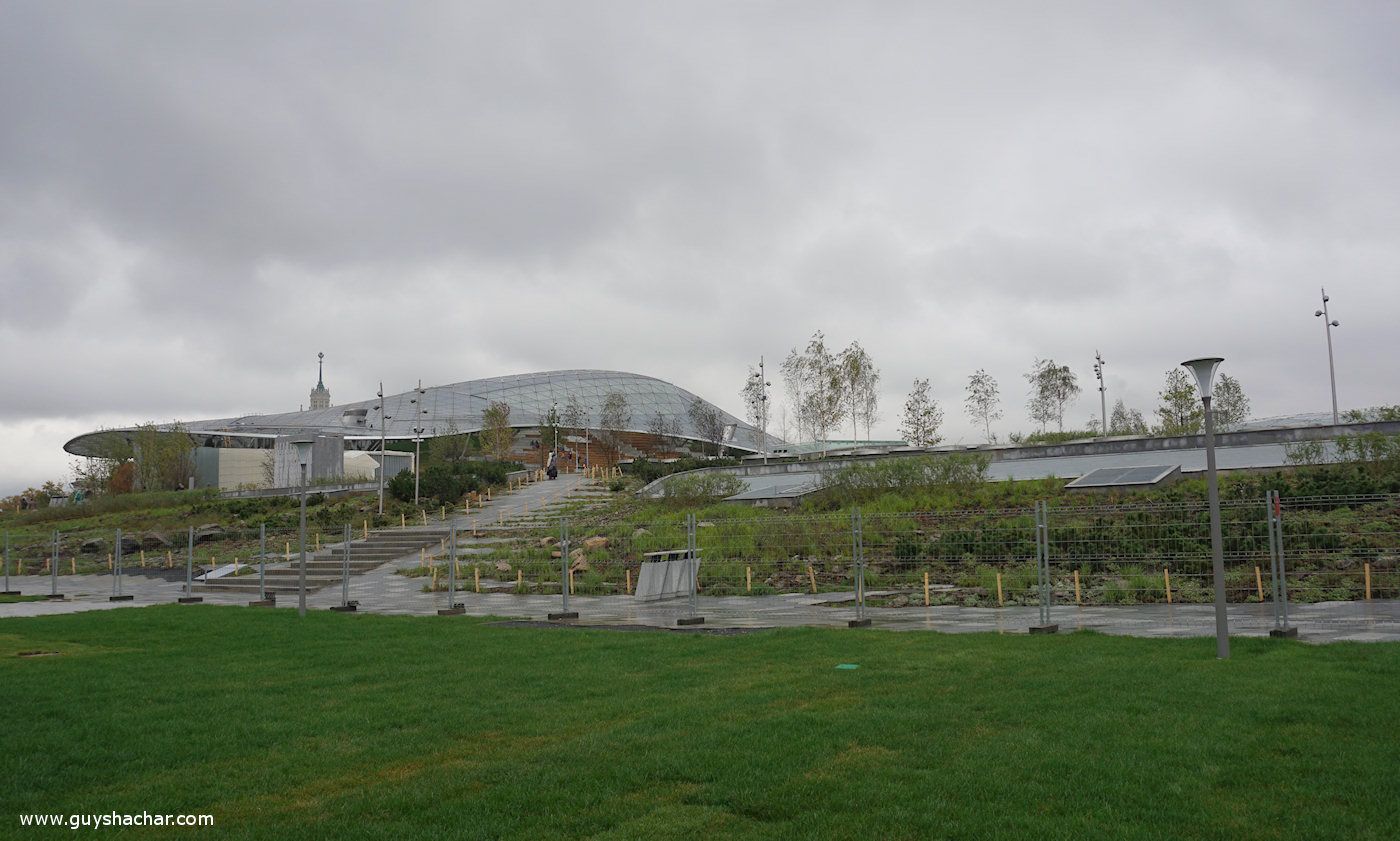
I heard about Zaryadye Park long ago, when its design competition took place, and I knew it was opened about a month prior to my visit. I was therefore surprised to see what looked like a temporary fence surrounding the inviting open area of the park.
I had to surround it, and walk through security! When I discovered the reason for the fence and security I was astonished. But first things first…
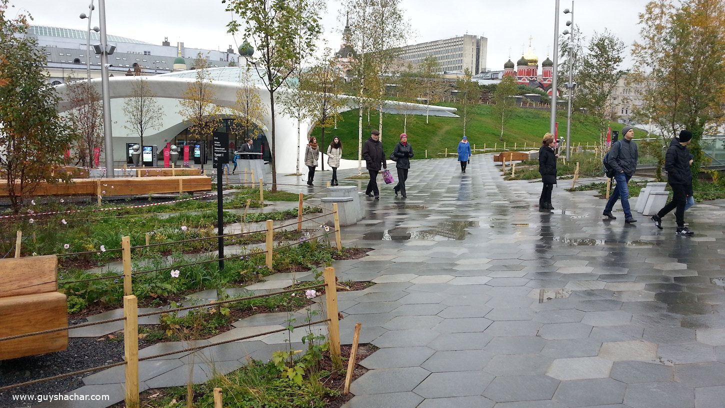
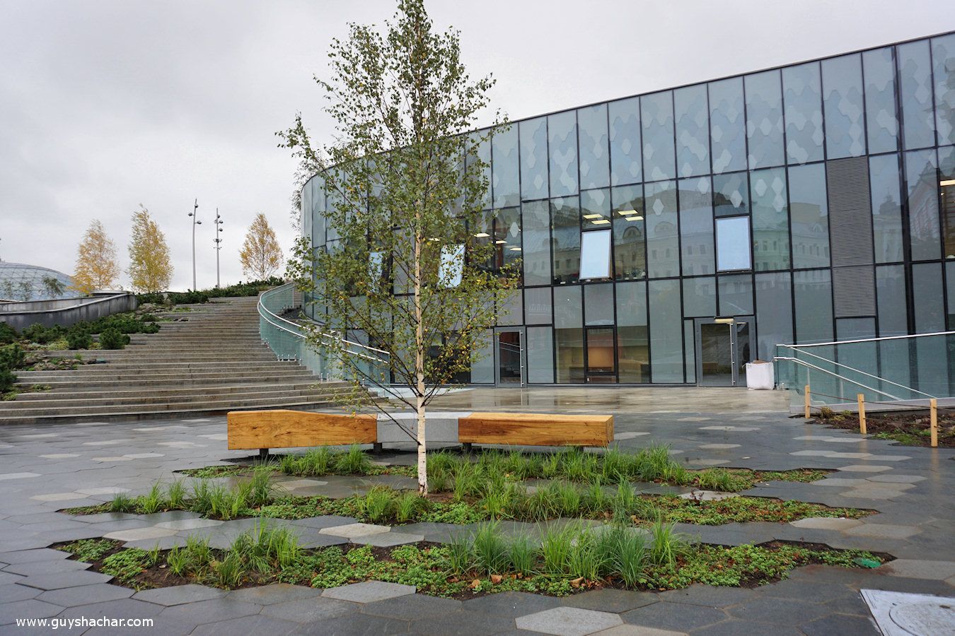
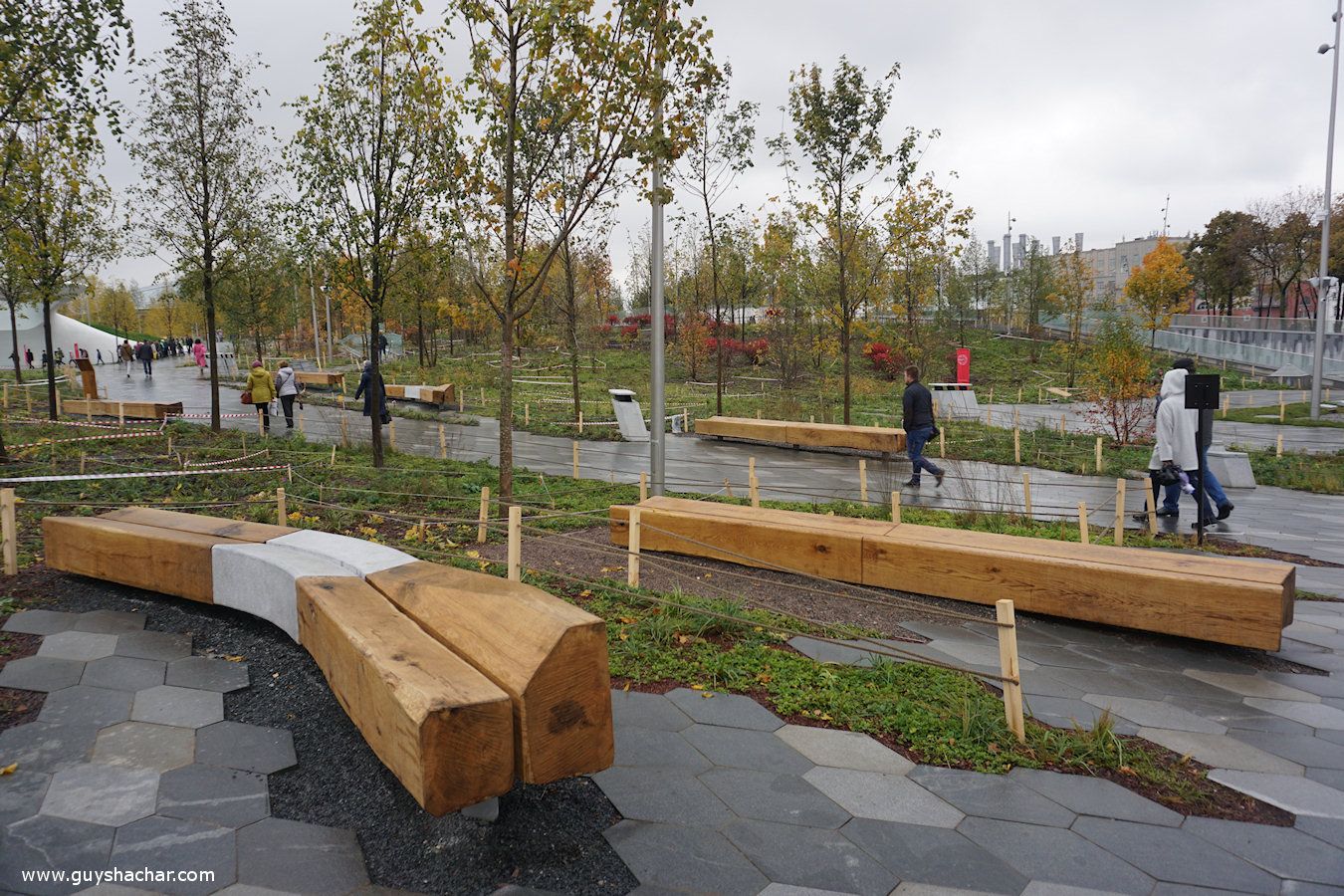
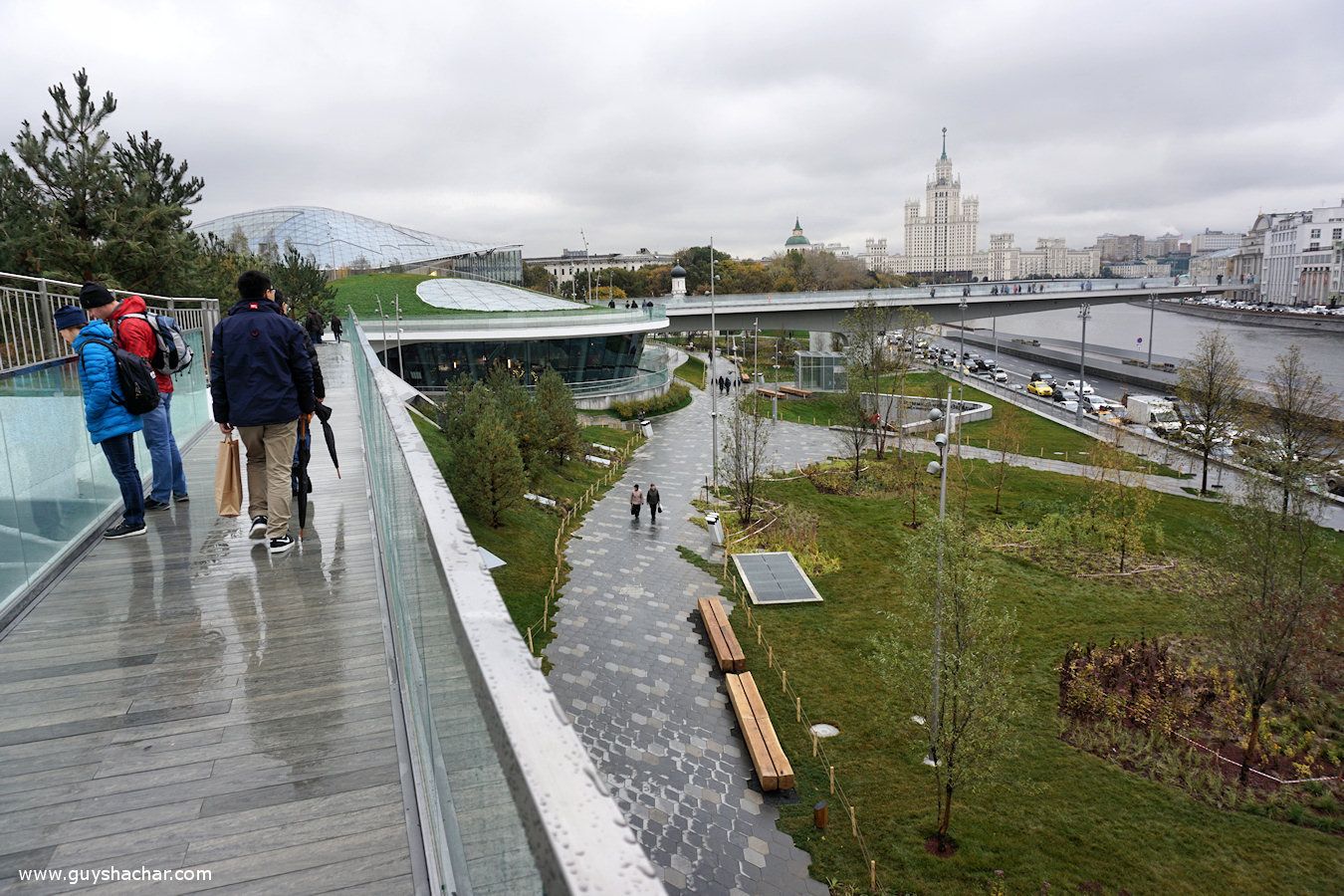
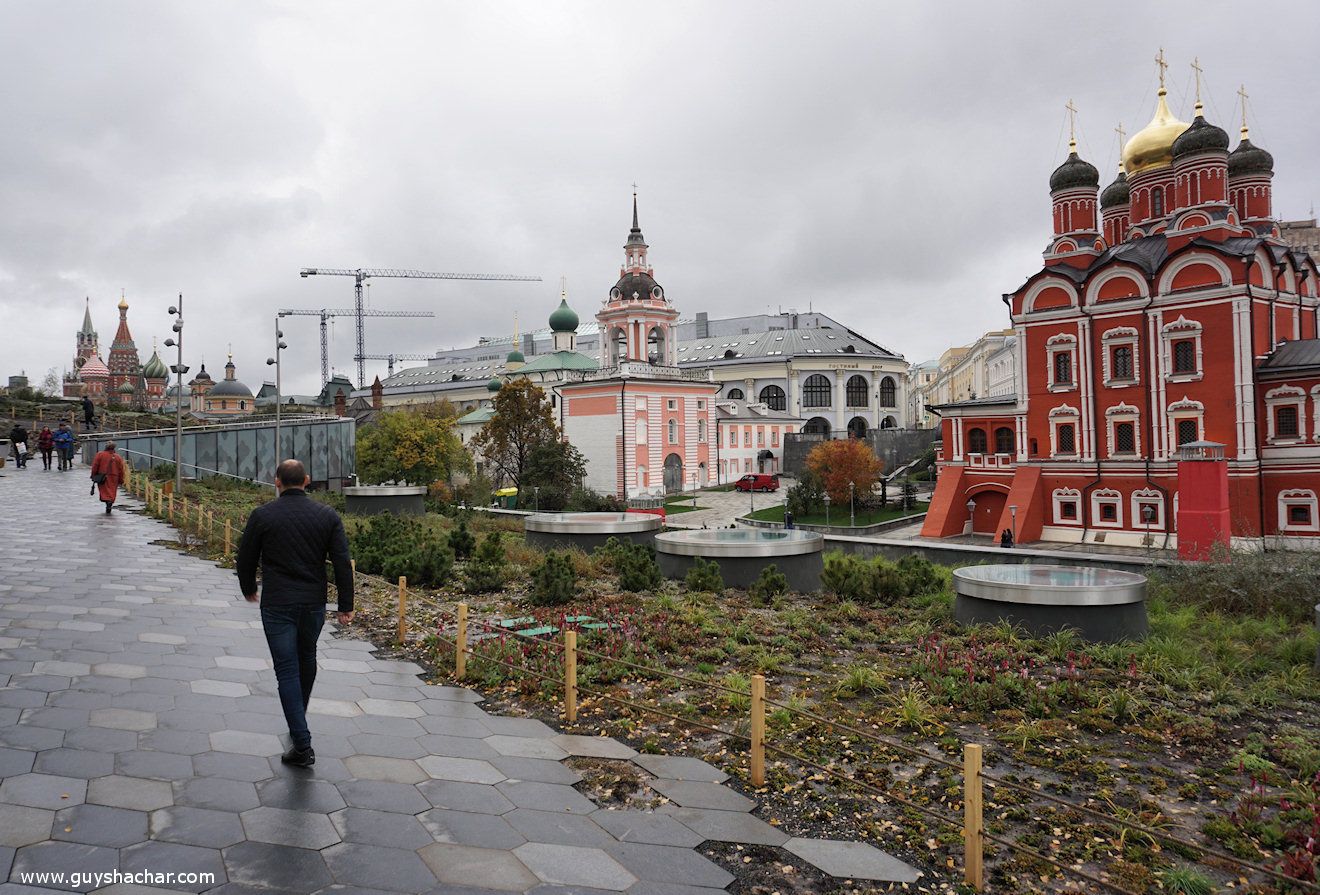
First thing you notice if you are pavement sensitive, is the hexagonal tiles. The whole park is dominated by these irregular symmetric hexagons. Such repetitive tiles correspond with the infamous repetitive soviet tile designs, yet not as annoying, due to combination of dark-gray and light-gray colors, as well as vegetation penetrating paved areas (or vice versa).
Looks familiar? Yep, the same idea was beautifully implemented before in Manhattan’s High Line elevated park. “Diller – Scofidio + Renfro”, the interdisciplinary design studio that was responsible for reshaping the High Line in New York, also won the competition to design Zaryadye Park, together with “Citymakers International” urban development company and “Hargreaves Associates” landscape architecture and planning firm.
Interesting elements such as benches and garbage cans “pop-up” from the hexagonal tiles and break as well the monotonous feel of the repetitive shapes.
These timber benches add a natural and wild feeling to the park. The park, built on bare land, is already a home to mature trees, which also adds to the welcoming feeling – it seems the park has been there already for a long time.
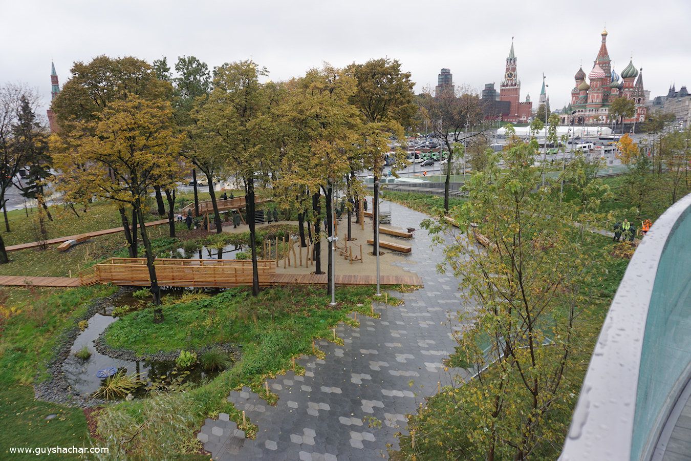
Additional mature trees can be found on the “Coastal Forest”, one of the several vegetation zones in the park. Its small pond is almost the only water feature in the park. The popular crave for water features might remain unfulfilled during occasional hot summer days of Moscow or by troubled souls seeking calming water.
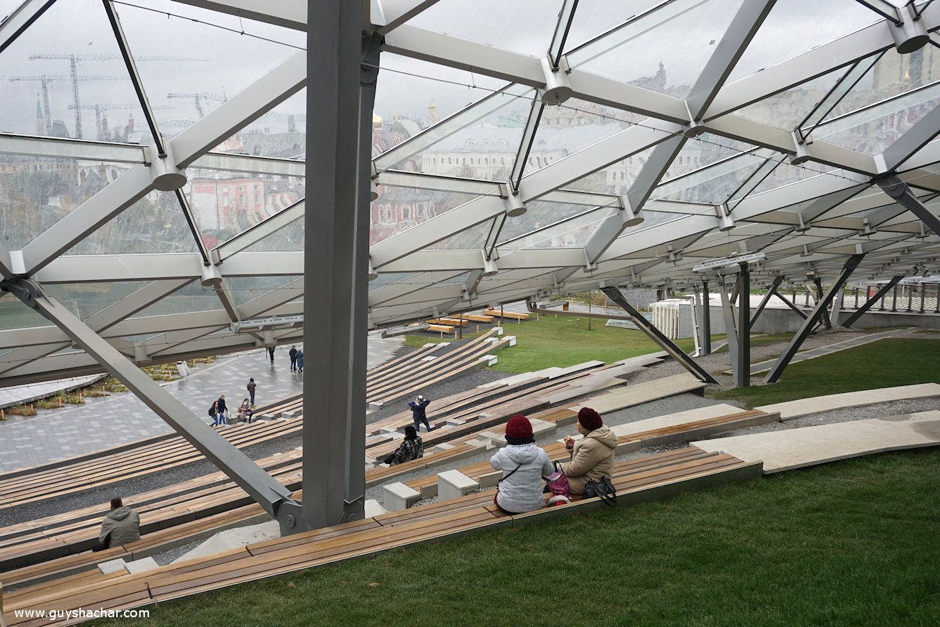
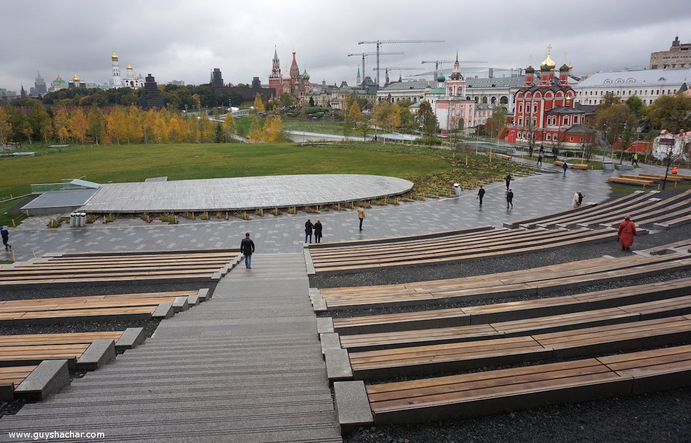
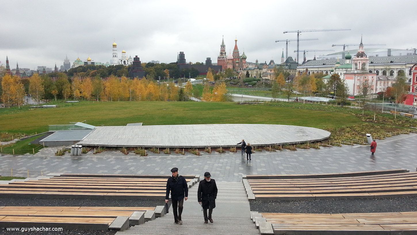
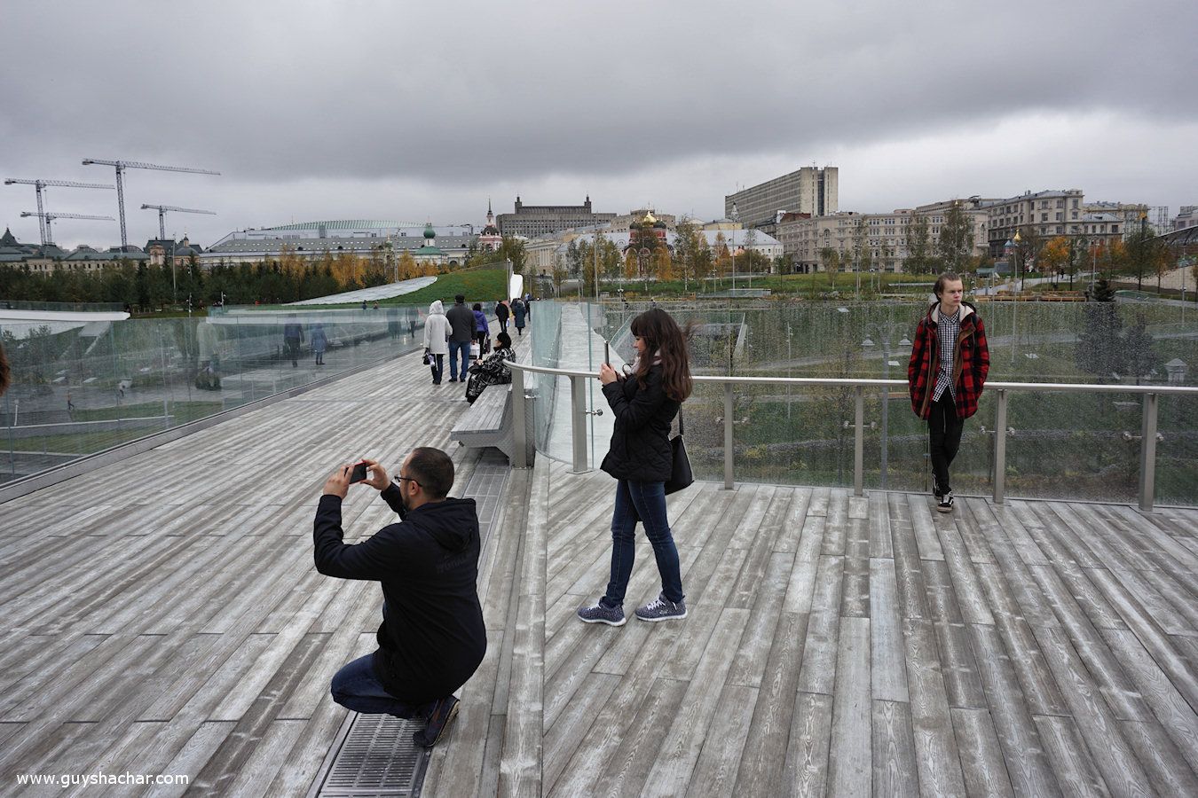
The large open theater is fun not only during events but also as a place to relax, especially during rainy days.
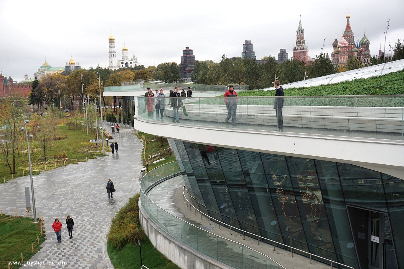
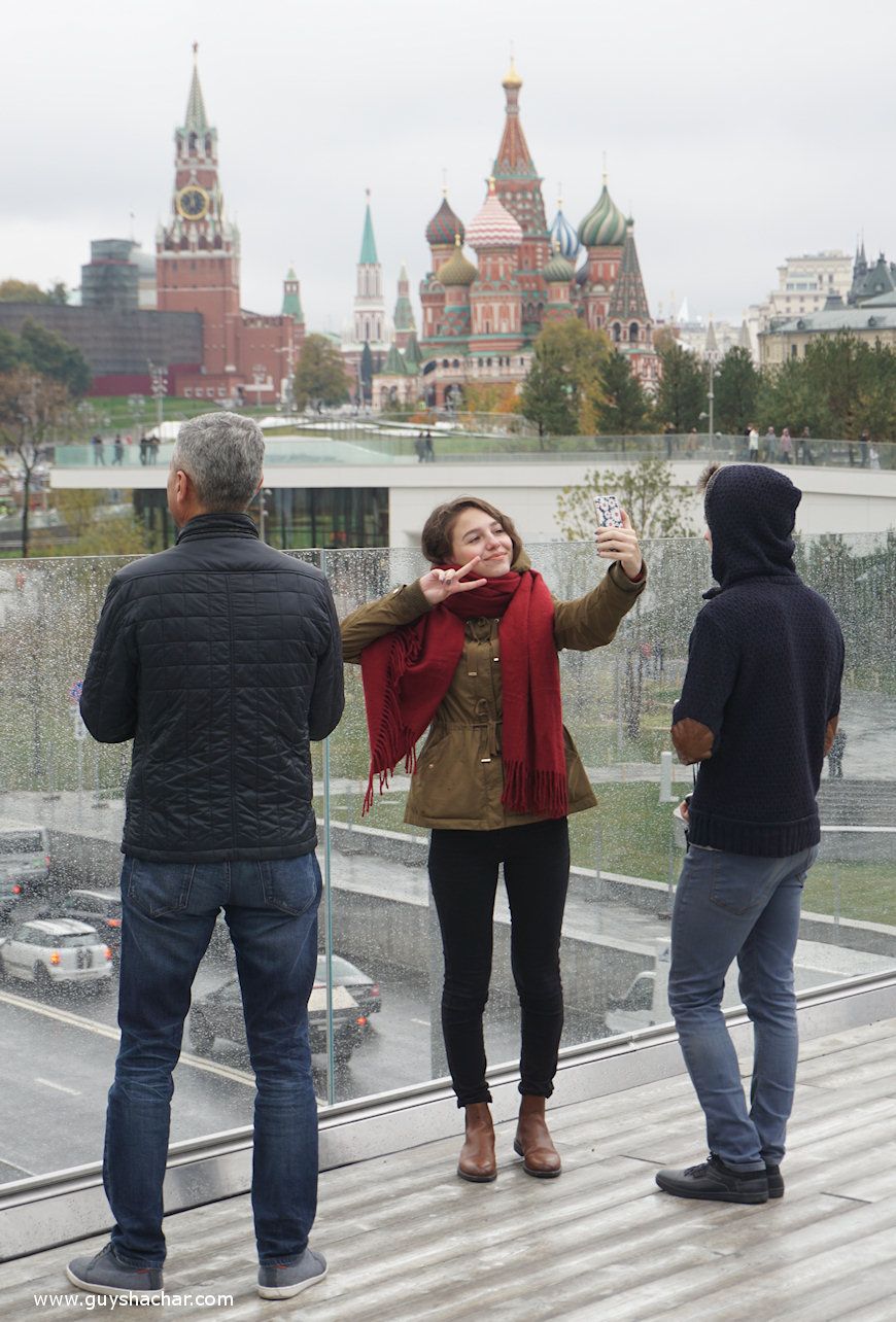
One of the best viewpoints of the park is from the theater, with a panoramic vista to the Kremlin and the enchanting 16th-century St. Basil’s Cathedral. Although the park was designed with notable topography, vistas to the Kremlin, the Cathedral and other monumental buildings in Moscow’s skyline remain clear.
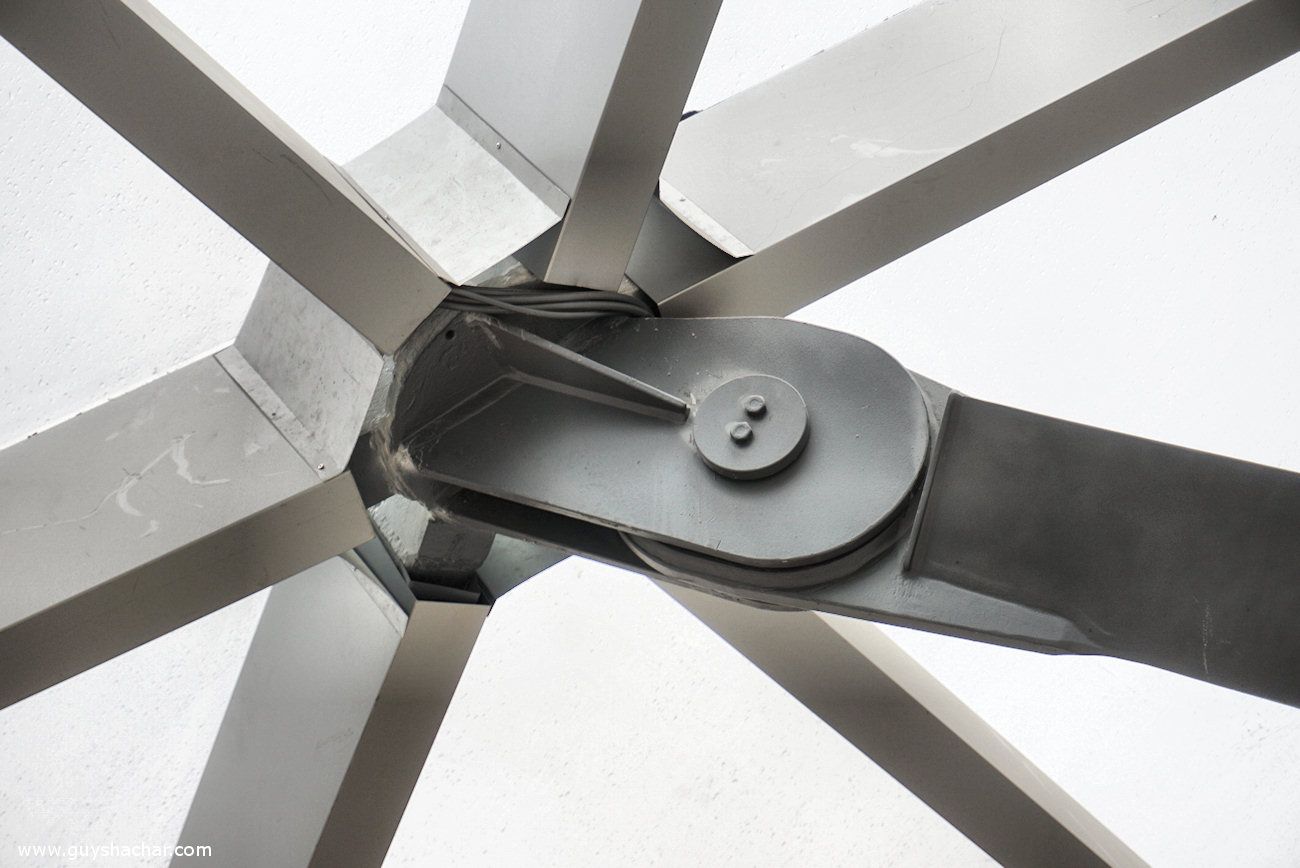
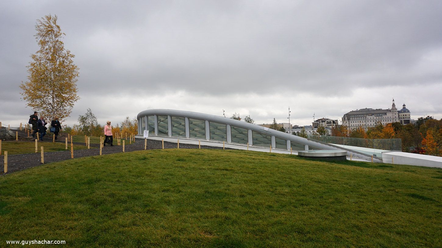
Thought was given to the details of the theater “Glass Crust” as well
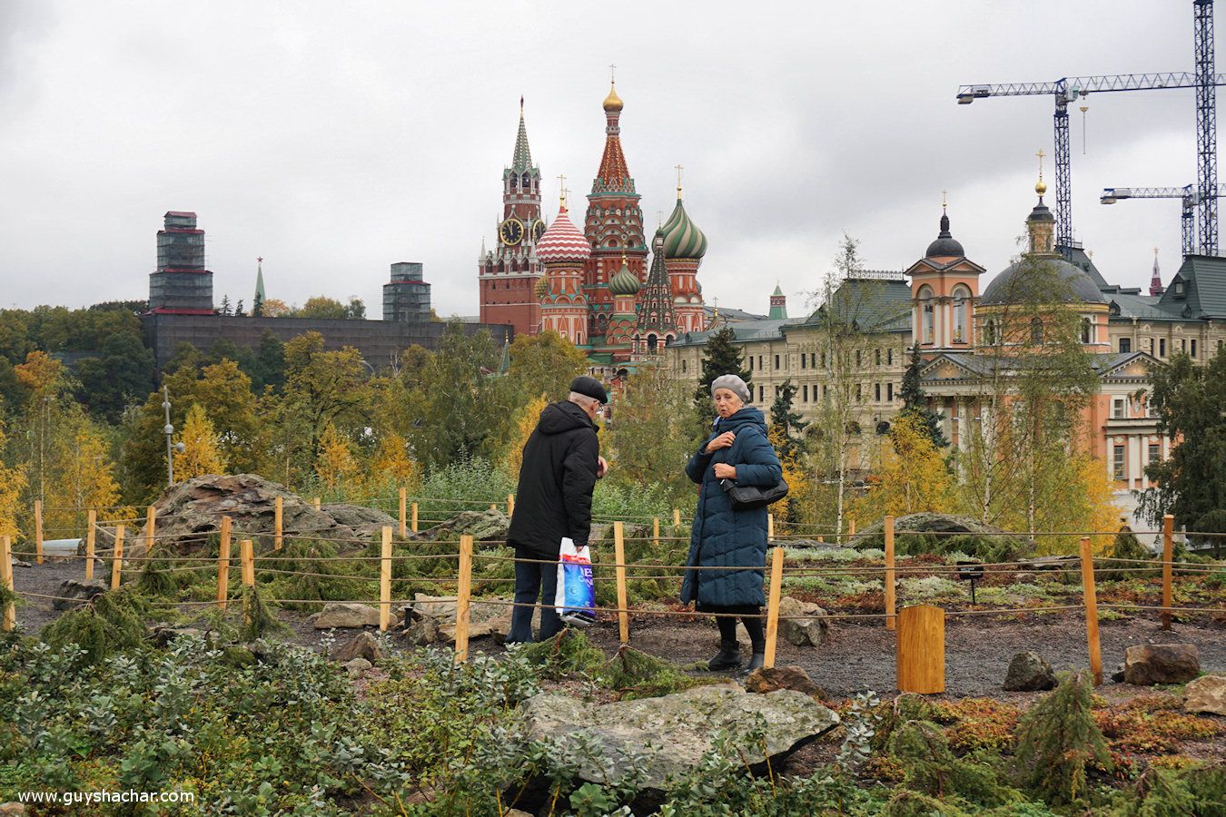
The “Northern Landscapes” hill is another good viewpoint to the surrounding area.
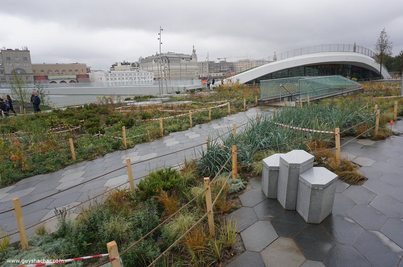
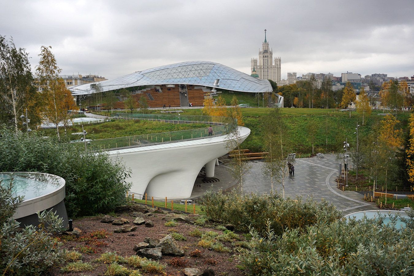
Looking to the east, the theater and its Glass Crust can be seen, as well as the curved lines of the Nature Center. This viewpoint exposes the park’s greatest achievements: charming assemblage of built-up and natural elements, and curved lines that stand in contrast to Moscow’s neoclassic / Russian / Soviet – Brutalist architecture. The result is an organic, “flowing” composition, in which structures, the trees and the vegetation seem as growing holistically.
This is another area of the park where this composition is realized. Visitors are exposed to this composition either by standing and watching other people meandering with its paths, or by walking, for a constantly changing and surprising composition. Other aspects that can be seen in the following photo is the layered design of the park. Paths and bridges on elevated levels play a significant role in the park, allow additional twists, turns and viewpoints. The central location of the park ensures that it would be always busy enough to accommodate all these pathways.
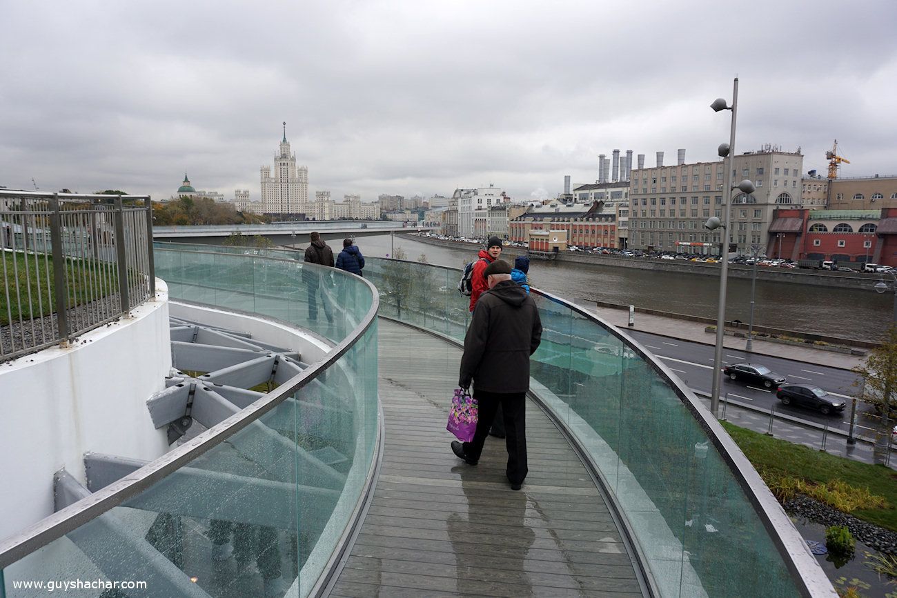
One of the most attractive places of the park – judging by the presence of visitors – and probably its icon, is the River Overlook – a “V” shaped bridge over Moskva river. A design idea becoming more and more popular (Next trip – Grand Canyon Skywalk?), it still does its magic.
Zaryadye Park is located on Zaryadye – a historical district founded in 12th-13th century, characterized by small streets and houses with mixed uses. It was demolished between 1936 to 1947, and between 1964 and 1967 the gigantic Rossiya Hotel was built there. With over 3,000 rooms, it was the world’s largest hotel until 1990. It was closed and demolished in 2006. Impressive monumental buildings still remained in Zaryadye, such as the Cathedral of Znamensky Monastery. In this particular spot it seems that the park naturally blends with the city, again, adding both a refreshing contrast and a complimentary appearance to the unique Russian architecture.
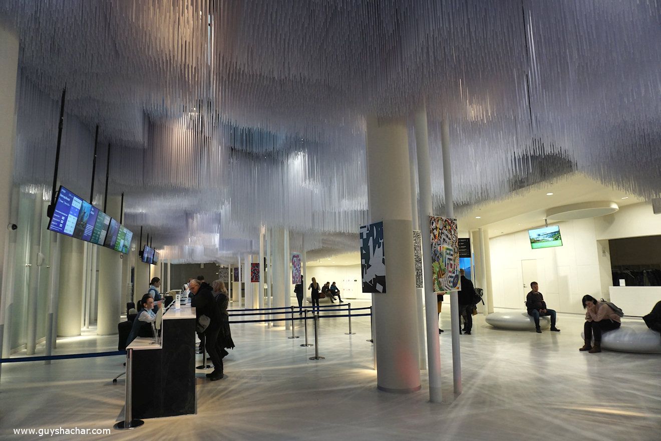
At the end of my tour I visited the Media Center, curious to understand the idea behind the park’s surrounding fence.
A welcoming girl in the information desk left me puzzled telling that during the opening day, locals managed to pick most of the newly planted plants and bulbs…
Zaryadye park is a wonderful space. It provides a successful combination of indoor and outdoor elements, built-up and natural ingredients, multi level pathways, carefully planned compositions of shapes and forms, and superb vistas where nearby sights complement, enrich and create an exciting dialogue with distant monumental sights.
It is a rare example for a place in which the border between architecture and landscape architecture does not exist. It is a holistic spatial creation. Hopefully, it shall serve as a beacon to integral design approach which will blur the unacceptable dichotomy between architecture and landscape architecture disciplines, which has been reflected for years in our environment and results in dull and discrete spaces.
One Response
יורם צביאלי, באר שבע
יופי